Sometimes we choose not to use the default color pallet offered by R.
In this post we’d be able to see some examples of alternative usage.
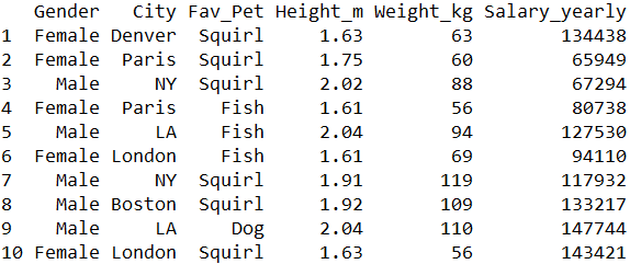
Setting up the data:
We’ll generate the data ourselves using set.seed(1000) command to retain the same data:
set.seed(1000)
Gender <- sample(size = 1000, replace = T, x = c("Male", "Female"))
City <- sample(size = 1000, replace = T,
               x = c("NY", "LA", "Boston", "Chicago", "Denver", "London", "Paris", "Rome"))
Fav_Pet <- sample(size = 1000, replace = T,
                  x = c("Cat", "Dog", "Fish", "Squirl"))

Salary_yearly <- sample(x = seq(55000, 150000), size = 1000, replace = T)
Weight_kg <- ifelse(Gender == "Male", sample(x = seq(80,120), size = 1000, replace = T),
                    sample(x = seq(45,70), size = 1000, replace = T))
Height_m <- ifelse(Gender == "Male", sample(x = seq(175,210), size = 1000, replace = T) / 100,
                    sample(x = seq(155,180), size = 1000, replace = T) / 100)

data <- data.frame(Gender, City, Fav_Pet, Height_m, Weight_kg, Salary_yearly)
This is a short view of the data created:
We’ll set a simple bar plot for city distribution broken by gender. This is the code for that:
ggp <- ggplot(data = data) +
  geom_bar(aes(x = City, fill = Gender), position = "dodge")
And this is the result:

scale_color_manual(). As arguments, we can either insert colors by there names, or as HEX codes. Here’s the code for using a direct color:ggp + scale_fill_manual(values = c("red", "blue"))And this is the result:

And here’s the code for using a hex notation:
ggp + scale_fill_manual(values = c("#126825", "#231999"))And this is how it looks:
