Jamovi enables a wide variety of descriptive statistics, and the work flow is very convenient and easy.
For test case we use a fictitious data of 634 respondents.
The dataset contains information about Age of respondents, Weight of respondents, Height of respondents, Yearly payment, City of residence and Job Seniority.
Here’s how the spreadsheet looks like:

Once clicking the “Analyses” tab, there are many options to analyze the data, starting from descriptive statistics (notated as “Exploration”), and going to inferential statistics, regression analyses, non-parametric tests and even factor analysis.
On top that, there’s a plus sign notated as “Modules” with a wide variety of data analyses options.
When it comes to descriptive statistics, the options are statistics measures, frequency tables and of course data visualizations notated as “Plots”.
Also grouping of the results is optional, notated as “Split by”.
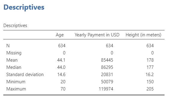
This is how the basic descriptive statistics output look like:
This is how the frequency tables look like:

As for data visualization, the options are very wide, starting from basic bar plots, all the way to density plots and violin box plots.
There’s an example for a combined histogram and density function:

There’s an example for the same plot, only split by all 10 cities in the sample:

There’s an example for bar plot + violin plot of weight of the respondents, split by City of residence:

In total, descriptive statistics is very convenient and easy-going using Jamovi, and the whole experience is very nice and easy.

