
Boxplot is a plot shaped as a box, which depicts the distribution of a variable using certain measures in this distribution, such as minimum, maximum, all quarterlies, inter quartile range (IQR) and even outliers of the distribution.
In R programming, there are several ways to create a boxplot; In this article, we’ll briefly discuss several ways and several twitches within those methods, to achieve a better-looking boxplot.
First, let’s generate the database we’ll work with:
That’s the code:
set.seed(1000)
Gender <- sample(size = 1000, replace = T, x = c("Male", "Female"))
City <- sample(size = 1000, replace = T,
               x = c("NY", "LA", "Boston", "Chicago", "Denver", "London", "Paris", "Rome"))
Fav_Pet <- sample(size = 1000, replace = T,
                  x = c("Cat", "Dog", "Fish", "Squirl"))

Salary_yearly <- sample(x = seq(55000, 150000), size = 1000, replace = T)
Weight_kg <- ifelse(Gender == "Male", sample(x = seq(80,120), size = 1000, replace = T),
                    sample(x = seq(45,70), size = 1000, replace = T))
Height_m <- ifelse(Gender == "Male", sample(x = seq(175,210), size = 1000, replace = T) / 100,
                   sample(x = seq(155,180), size = 1000, replace = T) / 100)

data <- data.frame(Gender, City, Fav_Pet, Height_m, Weight_kg, Salary_yearly)
And that’s the head() of the data I’ve created:

It can be shown I’ve used the set.seed() function with an argument 1000, so the data can be re-generated again precisely.
Boxplot in base R:
A boxplot in base R isn’t too fancy to look at, but it has quite a bit of functionality, as all base-r plots have, and it can depict the distribution solely or split it to subgroups.
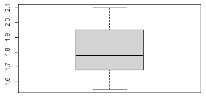
In this example, we’ll show a boxplot of the height in the distribution:
This is the basic code for example:
boxplot(data$Height_m)And this is how it looks:
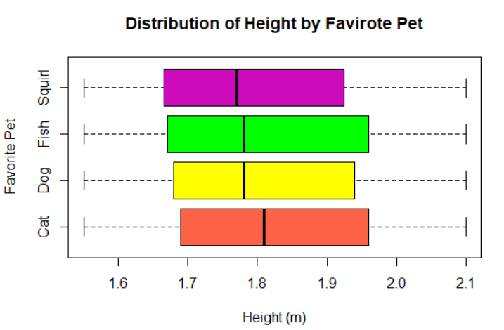
And this is the code for a different shape of the boxplot, split by another variable and with extra features like axes names and main title of the plot:
boxplot(data$Height_m~data$Fav_Pet, horizontal = T,
        col = c("tomato","yellow","green","2582246"), xlab = "Height (m)",
        ylab = "Favorite Pet", main = "Distribution of Height by Favirote Pet")
And this is how it looks like:
Boxplot in ggplot2:
With the ggplot2 package, it’s also possible to sketch a boxplot, and use all the extra various features ggplot2 has to offer.
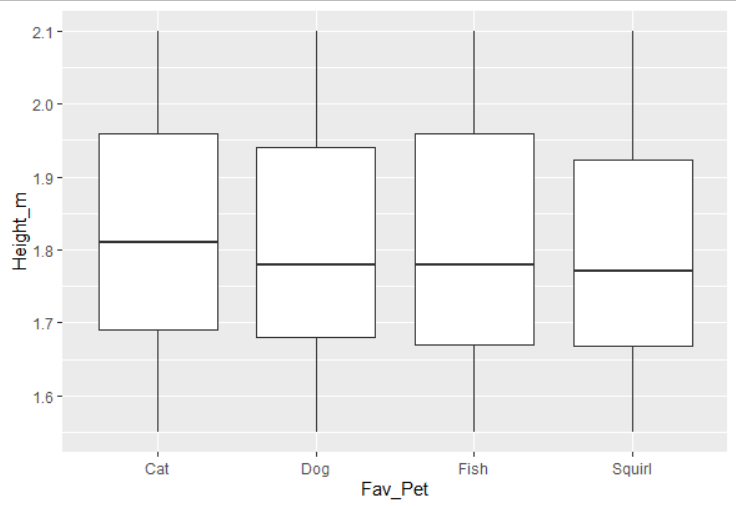
That’s the code for the basic ggplot2 boxplot:
ggplot() + geom_boxplot(aes(y = Height_m, x = Fav_Pet), data)And that’s how it looks:
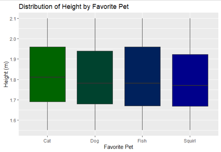
And this is a fancier version of the same boxplot in ggplot2:
col1 <- colorRampPalette(c("darkgreen","darkblue"))
ggplot() + geom_boxplot(aes(y = Height_m, x = Fav_Pet), data,
                        fill = col1(4)) +
  ggtitle("Distribution of Height by Favorite Pet") + ylab("Height (m)") +
  xlab("Favorite Pet")
And this is how it looks like:
Boxplot in plotly:
In plotly, there’s also the option for showing boxplot. Also, plotly’s plots are dynamic, so hovering over them, usually enables further insights.
This is the code for that:
library(plotly)
plot_ly(data = data, x = ~Height_m, y = ~Fav_Pet, type = "box",
        color = Fav_Pet)
And this is how it looks (without the hovering properties):

