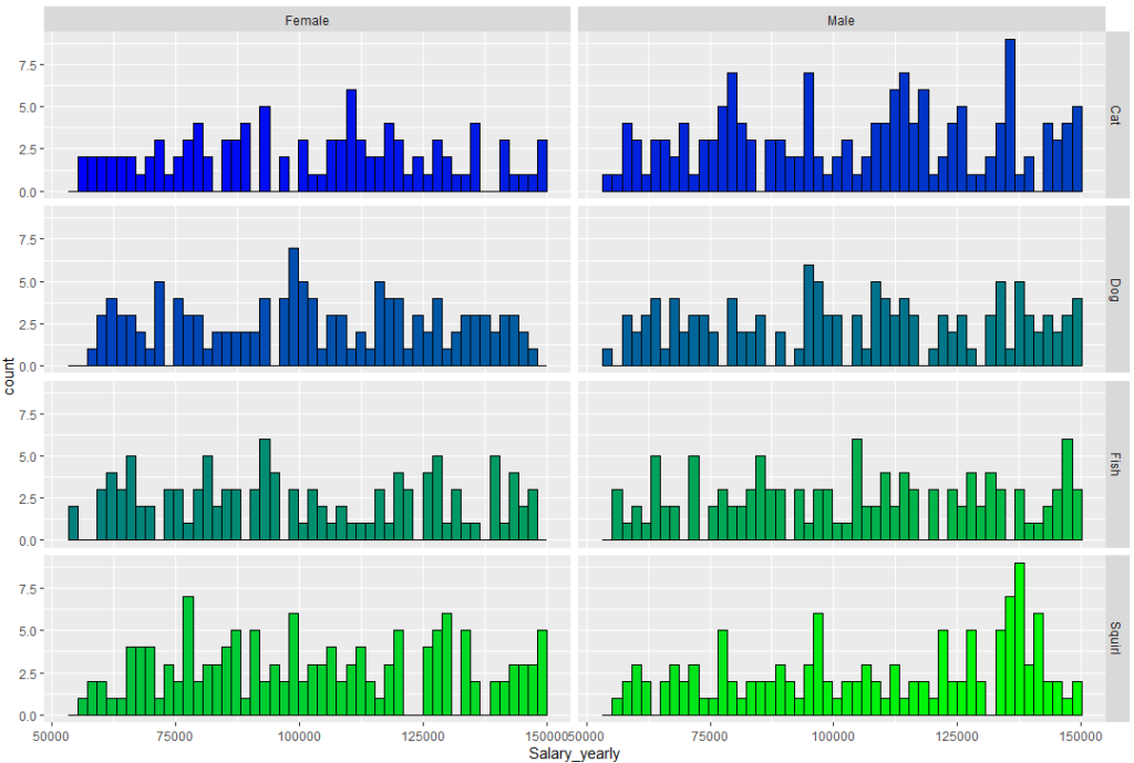
Sometimes we want to show separate groups from a single dataset, upon a histogram plot.
In R we can do it in several ways.
In this article, we’ll discuss how to do it using the ggplot2 package, and the facet_grid tool.
First, let’s generate our dataset.
We’ll also use the set.seed command, so this dataset can be regenerated.
set.seed(1000)
Gender <- sample(size = 1000, replace = T, x = c("Male", "Female"))
City <- sample(size = 1000, replace = T,
               x = c("NY", "LA", "Boston", "Chicago", "Denver", "London", "Paris", "Rome"))
Fav_Pet <- sample(size = 1000, replace = T,
                  x = c("Cat", "Dog", "Fish", "Squirl"))

Salary_yearly <- sample(x = seq(55000, 150000), size = 1000, replace = T)
Weight_kg <- ifelse(Gender == "Male", sample(x = seq(80,120), size = 1000, replace = T),
                    sample(x = seq(45,70), size = 1000, replace = T))
Height_m <- ifelse(Gender == "Male", sample(x = seq(175,210), size = 1000, replace = T) / 100,
                   sample(x = seq(155,180), size = 1000, replace = T) / 100)

data <- data.frame(Gender, City, Fav_Pet, Height_m, Weight_kg, Salary_yearly)
Let’s get a glimpse on the code we got:

We’ll want to show different histograms of weight for males and females.
This is the code for doing it, using ggplot2:
ggplot(data = data, aes(x = Height_m, fill = Gender)) +
  geom_histogram(position = "identity", alpha = 0.6, bins = 30) +
  ggtitle("Height in meters per Gender")
And this is how it looks:

And this is the code using the facet_grid tool:
col1 <- colorRampPalette(colors = c("pink","blue"))

ggplot(data, aes(x = Height_m)) +
  geom_histogram(fill = col1(60), color = "black") +
  facet_grid(rows = vars(Gender)) +
  ggtitle("Height Distribution by Gender")
And this is the result:
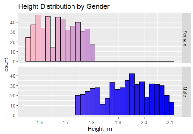
Note that in this case, to fit the resolution of colors, we needed to use the command colorRampPallete, and we needed to state the exact number of colors to apply in this case (60).
We can also change them from overlaying each other, to being column next to column:
ggplot(data, aes(x = Height_m)) +
  geom_histogram(fill = col1(60), color = "black") +
  facet_grid(cols = vars(Gender)) +
  ggtitle("Height Distribution by Gender")
And this is how it looks: